
On this page
- The Results: One Homepage, Two Lab Tests
- 1. Start With the Page People Need
- 2. Frontend Performance Optimization Starts With Images
- 3. Frontend Performance Optimization: Prioritize the Hero Image
- 4. Lazy-Load Images Further Down the Page
- 5. Frontend Performance Optimization With Fonts
- 6. Load CSS and JavaScript Only Where Needed
- 7. Keep Performance, Accessibility and SEO Separate
- A Repeatable Frontend Performance Optimization Workflow
- What I Took From This Rebuild
Frontend performance optimization became a practical part of rebuilding my portfolio at bajram.dev. I wanted the site to present my projects and tutorials clearly, while keeping its images, fonts and frontend resources under control.
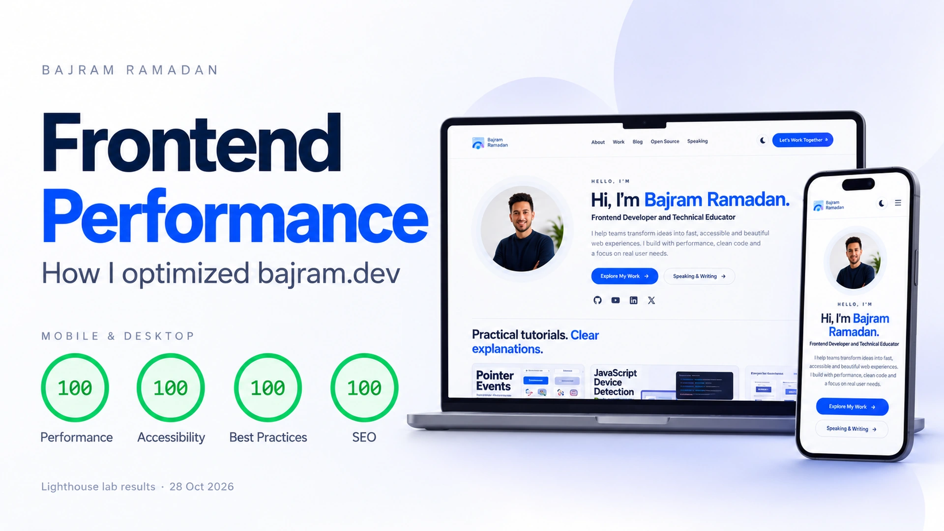
On October 28, 2026, the homepage received 100 in Performance, Accessibility, Best Practices and SEO in the PageSpeed Insights mobile and desktop tests shown in this article.
Those results are a useful milestone. The more useful story, however, is in the implementation: responsive images, appropriate loading priorities, smaller icon fonts and page-specific assets.
Here is how those frontend decisions work, and what the test results actually show.
The Results: One Homepage, Two Lab Tests
The screenshots record the following results for the homepage:
| Metric | Mobile | Desktop |
|---|---|---|
| Performance | 100 | 100 |
| Accessibility | 100 | 100 |
| Best Practices | 100 | 100 |
| SEO | 100 | 100 |
| First Contentful Paint | 1.1 s | 0.3 s |
| Largest Contentful Paint | 1.4 s | 0.8 s |
| Total Blocking Time | 40 ms | 40 ms |
| Cumulative Layout Shift | 0 | 0 |
| Speed Index | 1.5 s | 0.6 s |
Test date: October 28, 2026. Tested URL: https://bajram.dev/.
These are individual Lighthouse lab runs, not a site-wide average or a guarantee for every visitor. PageSpeed Insights distinguishes controlled lab measurements from real-user field data. The screenshots show “No Data” in the real-user section, so they do not establish a field Core Web Vitals pass.
Google explains this distinction in its PageSpeed Insights documentation.
I do not have a controlled before-and-after dataset for every change. Therefore, I am documenting the implementation and the recorded results, rather than assigning a particular score increase to each decision.
1. Start With the Page People Need
The frontend brings together the content, layout and interactions visitors use in their browser.
For my portfolio, I focused on HTML structure, CSS layouts, JavaScript behaviour and the resources each page downloads. Project cards, article previews and the hero section each have different requirements.
This gives me a useful question to ask when adding a feature:
Does a visitor need this resource to use this page?
That question applies to a script, an image, a font or an embedded service. It keeps the implementation connected to the content the page actually presents.
You can see the result across my project case studies and practical tutorials.
2. Frontend Performance Optimization Starts With Images
I replaced the site’s JPG images with WebP versions as part of the rebuild. However, the file extension was only one part of the work.
A small card and a large cover do not need the same image dimensions. I therefore use multiple image sizes rather than asking every layout to display the largest available file.
In the browser, the important part is the resulting image markup: the image URL, its dimensions, the responsive candidates and its loading behaviour.
For example, the rendered hero portrait includes a srcset with multiple image widths and this sizes value:
sizes="(max-width: 760px) 204px,
       (max-width: 1040px) 235px,
       285px"
This describes the expected rendered width of the portrait at different viewport sizes. Together with srcset, it helps the browser choose a suitable image candidate for the display and device pixel density.
The browser does not have to treat the portrait as a full-width image when it occupies a much smaller space in the layout.
The browser makes its selection from the supplied candidates; sizes describes the layout width rather than a fixed download size.
3. Frontend Performance Optimization: Prioritize the Hero Image
The portrait appears in the opening section, so the theme does not lazy-load it.
Here is a simplified version of the portrait’s HTML. The filenames are illustrative; in your own project, point them to your actual image files:
<img
  src="portrait-1024.webp"
  srcset="portrait-300.webp 300w,
          portrait-768.webp 768w,
          portrait-1024.webp 1024w,
          portrait-1254.webp 1254w"
  sizes="(max-width: 760px) 204px,
         (max-width: 1040px) 235px,
         285px"
  width="1024"
  height="1024"
  loading="eager"
  fetchpriority="high"
  decoding="async"
  alt="Bajram Ramadan, frontend developer and technical educator"
>
Here, loading="eager" avoids deferring the portrait through lazy loading. Meanwhile, fetchpriority="high" signals its relative importance to the browser.
I use this treatment for a prominent image, rather than marking every image as high priority. It is also important to inspect which element is actually reported as LCP; these screenshots alone do not identify the LCP element.
Read more about resource loading with the Fetch Priority API.
4. Lazy-Load Images Further Down the Page
Images in the homepage’s project and article cards use native lazy loading.
This simplified HTML example shows the loading attribute alongside dimensions:
<img
  src="project-preview.webp"
  width="800"
  height="450"
  loading="lazy"
  alt="Project interface preview"
>
The example dimensions describe this sample image. Use dimensions and alternative text appropriate to your own file.
The browser can delay fetching images that are sufficiently far from the viewport. No additional JavaScript lazy-loading library is needed for this behaviour.
The distinction is practical: make the opening content available promptly, while avoiding unnecessary early image requests for content further down the page.
Width and height attributes also provide information the browser can use to reserve image space. The theme’s responsive CSS keeps images within their containers:
 img {
  max-width: 100%;
  height: auto;
}
Lazy loading should follow the layout, rather than being applied to every image automatically. The browser-level lazy-loading guide explains the approach in more detail.
5. Frontend Performance Optimization With Fonts
The main body typography uses a system font stack:
body {
  font: 400 16px/1.65 system-ui, -apple-system, 'Segoe UI', Arial, sans-serif;
}
This avoids a separate downloadable font for the body’s text. The exact font can vary by operating system, so the layout still needs to accommodate those differences.
Icons are handled separately. The theme uses locally hosted Font Awesome files, with subsets for commonly used icons and fallback files for other supported glyphs.
The relevant font files in the theme have these sizes:
| Icon font | Full font file | Theme subset |
|---|---|---|
| Solid | 158,220 bytes | 14,608 bytes |
| Brands | 118,680 bytes | 3,964 bytes |
| Combined | 276,900 bytes | 18,572 bytes |
This compares the files on disk. It is not a measurement of the total bytes transferred by every page.
The stylesheet uses unicode-range to separate the subsets from the remaining glyphs. Consequently, requests depend on which icons the page uses. Adding an icon outside a subset can require another font file.
See MDN’s unicode-range reference for how that selection works.
6. Load CSS and JavaScript Only Where Needed
Frontend performance optimization also means checking which CSS and JavaScript files each page needs before adding more resources.
The homepage does not need all the styling and interaction code used by an individual article.
The homepage loads its shared styles and site interactions. Article pages additionally load the resources used for the blog layout and article features.
From the browser’s perspective, that means an article can request a stylesheet and script that the homepage does not need.
For example, an article-specific stylesheet belongs on the relevant page:
<link rel="stylesheet" href="/assets/css/blog.css">This is an illustrative asset path. The important part is checking which pages request it, rather than adding it to every page automatically.
The shared site script appears after the main page markup. A simplified placement looks like this:
  <main>
    <!-- Page content -->
  </main>

  <script src="/assets/js/site.js"></script>
</body>
Placement near the end of the document is not the same as adding defer. It keeps that script after the main markup, while its execution still needs to be reviewed for unnecessary work.
The current homepage also includes analytics resources. Keeping theme assets focused does not remove the need to review third-party scripts as the site changes.
7. Keep Performance, Accessibility and SEO Separate
The four scores appear together, but they answer different questions.
A score of 100 in the Lighthouse accessibility checks does not prove complete accessibility. Manual checks are not included in that score, as explained in the Lighthouse accessibility scoring documentation.
Keyboard navigation, focus behaviour, meaningful labels and actual content still need attention. My CSS pointer-events tutorial and demo provide one example of why mouse testing alone is insufficient.
Similarly, the SEO audit result does not establish a search ranking. Titles, descriptions and social-sharing images serve their own purposes; correcting them should not be presented as a direct speed improvement.
A Repeatable Frontend Performance Optimization Workflow
For the next change, I want to make the comparison easier to evaluate:
- Record the tested URL, date and current implementation.
- Capture the network requests and identify the largest resources.
- Change one relevant part of the page.
- Run several comparable mobile and desktop tests.
- Compare the measurements and check that the page still works.
- Follow real-user data when enough samples become available.
Repeated runs are a better basis for comparison than choosing one favourable screenshot. The original results remain useful as a dated record, while later measurements can show whether the site continues to perform well.
I would also test representative article and project pages. A homepage score does not describe every template on the website.
What I Took From This Rebuild
My frontend performance optimization work focused on decisions I could inspect in the browser and frontend assets: image formats and sizes, loading priorities, font delivery and conditional resources.
The recorded mobile and desktop results give me a useful checkpoint. Maintaining them means continuing to review the content and resources added after launch.
If you are working on a similar site, start with one page and one clear question: what is the browser being asked to load, and does it need all of it now?
Explore my Frontend Playground for smaller experiments, or get in touch if you would like to discuss a website or frontend project.
ARTICLE FEEDBACK
Was this article helpful?
Your feedback helps me improve future tutorials.
Saving your rating stores a browser identifier for one year so you can update or delete your vote. Feedback is anonymous; please do not include personal information.
These scores reflect reader opinions, not an objective readability or accuracy test.
What’s the first thing you check when a page loads slowly?
My starting point is the Network panel: which files are loading, how large are they, and when are they requested? Then I check which element is responsible for LCP. That helps me choose a specific change and measure whether it actually improves loading.