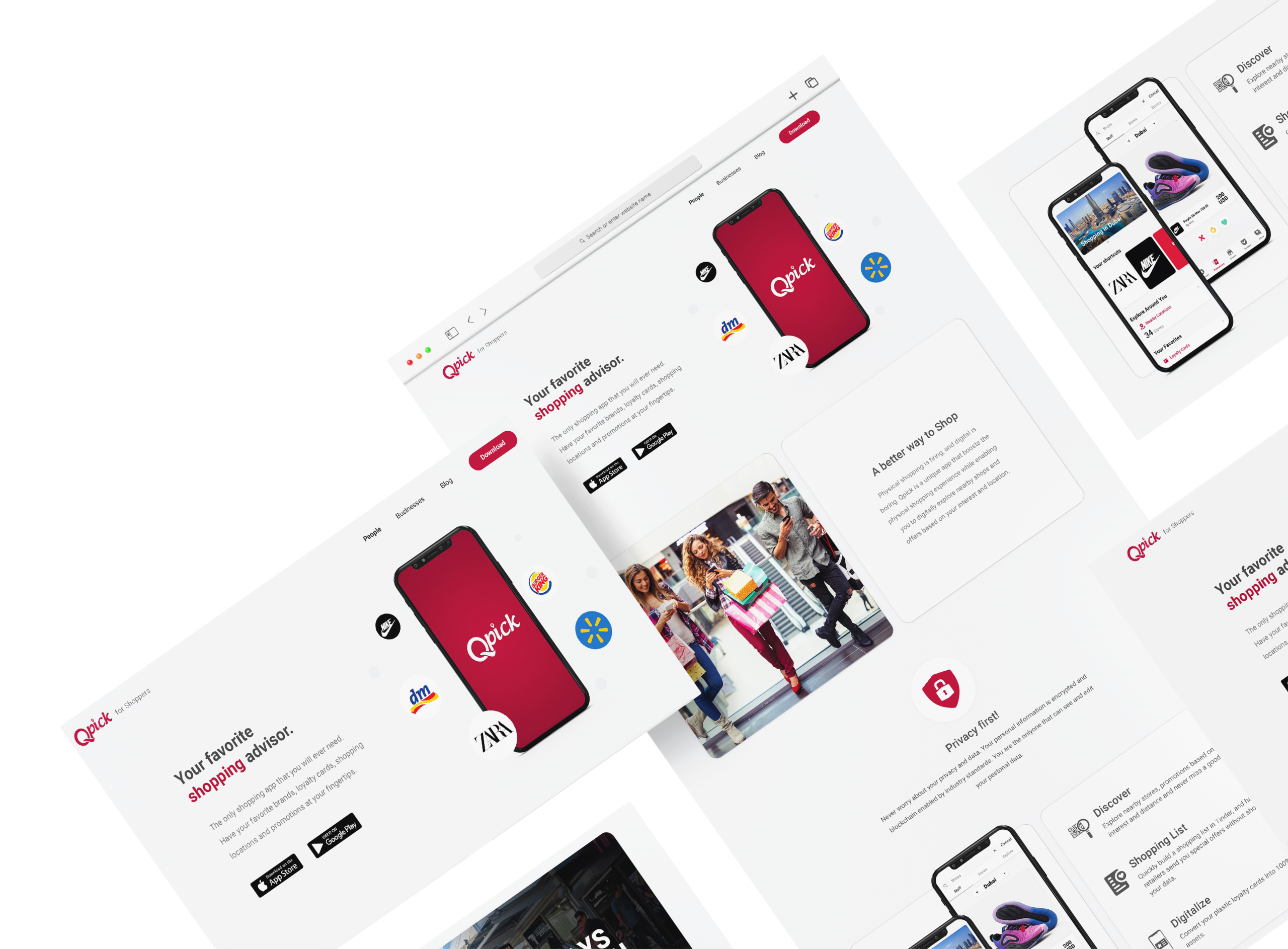
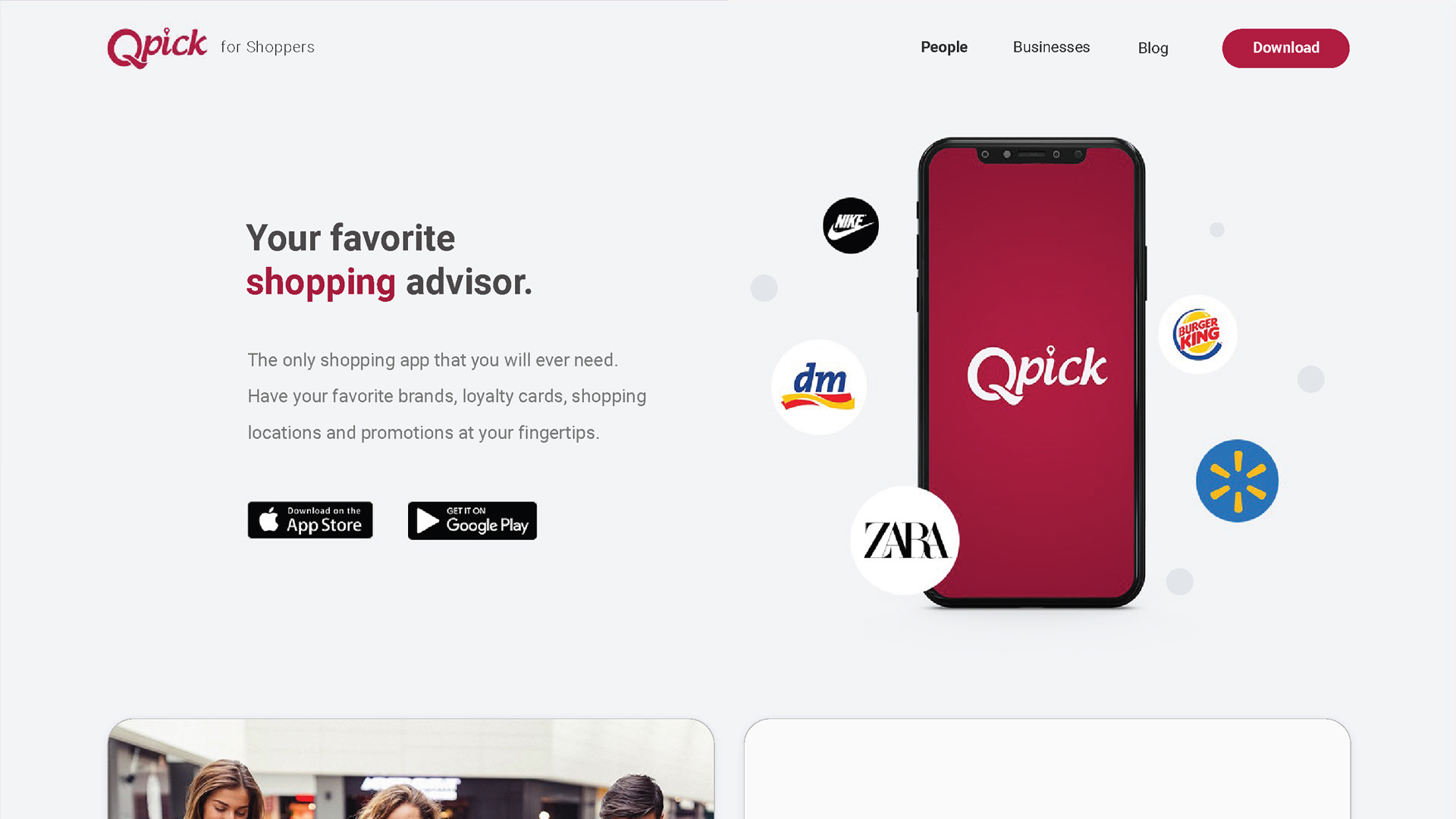
Qpick
Responsive Frontend Development for a Digital Platform
Large-scale frontend delivery across responsive screens and reusable UI components.
- Role: Front End Developer
- Platform: HTML5, CSS3 & JavaScript
- Duration: 1 year
- Year: 2022
Screens
80-100
Responsive screens delivered
Components
150–200
Reusable UI components
Time
6 Months
Main production delivery period
QA
Multi-Device QA
Desktop, tablet, and mobile testing
The challenge
The project required a large number of responsive screens and reusable interface components to be delivered within a fast production schedule while maintaining visual consistency and code quality.
- Translating Photoshop and Figma designs into production-ready interfaces
- Maintaining consistency across 80–100 screens
- Building reusable components for repeated interface patterns
- Supporting responsive behavior across desktop, tablet, and mobile
- Coordinating frontend delivery within an active product workflow
- Testing interfaces across browsers and devices
The solution
- Converted Figma and Photoshop designs into responsive production interfaces
- Built reusable UI components with HTML, Sass, JavaScript, and Bootstrap
- Created consistent responsive behavior across multiple screen sizes
- Supported API-connected interface functionality
- Performed cross-browser and multi-device testing
- Refined frontend quality through QA feedback and iterative improvements
Design & key screens

Homepage
Responsive frontend screens developed from design files for consistent use across desktop and tablet environments.
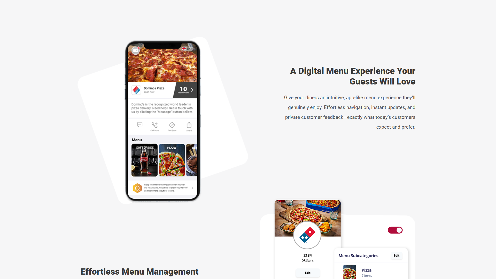
QpickMenu
A structured interface system designed to organize navigation, content, and repeated interaction patterns.
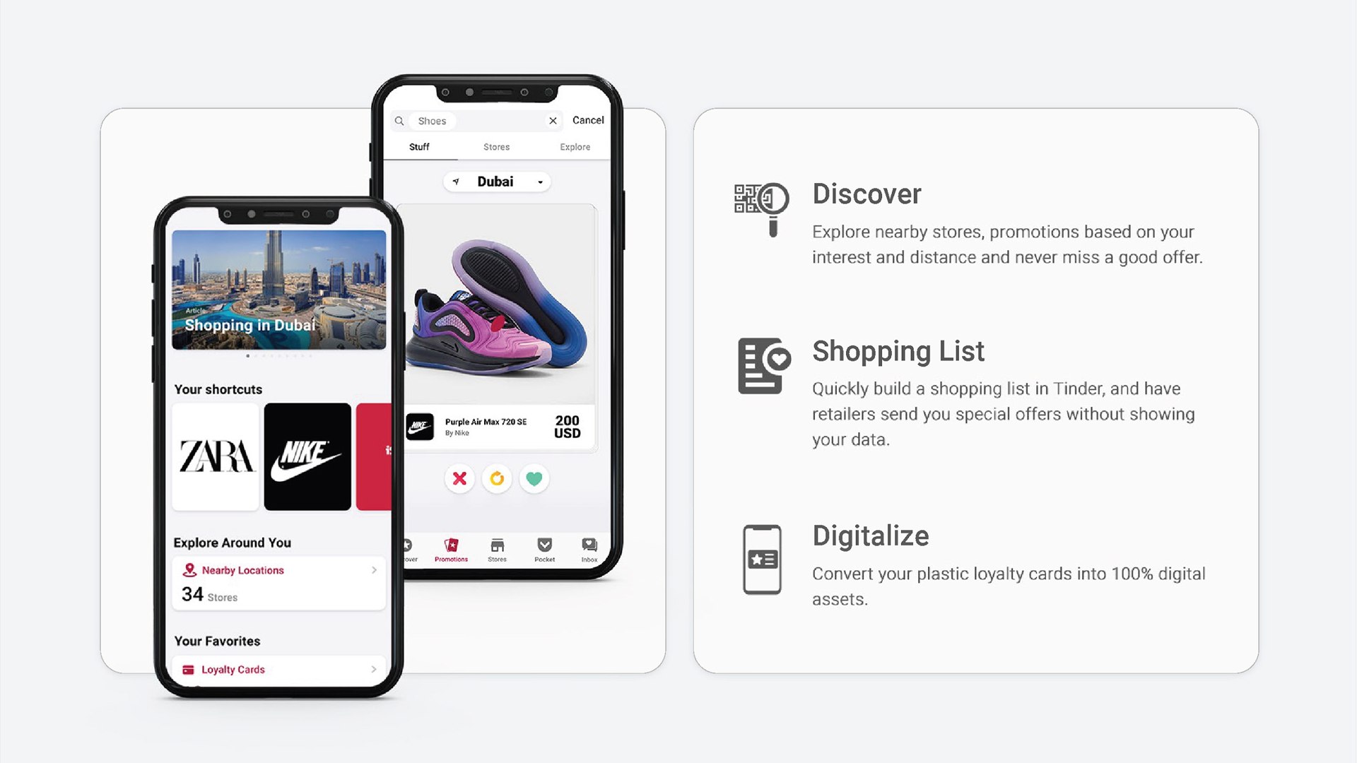
Mobile App
Responsive layouts adapted for smaller screens with attention to spacing, hierarchy, and usability.
Testimonial
Tech stack
HTML5
CSS / Sass
JavaScript
Bootstrap
React.js
Git
Need reliable frontend support for a large digital product?
Let’s build responsive, reusable interfaces that remain consistent across screens, devices, and releases.